
CASE_001
Pop the Corn
2023
Branding
48.8566°N / 2.3522°E
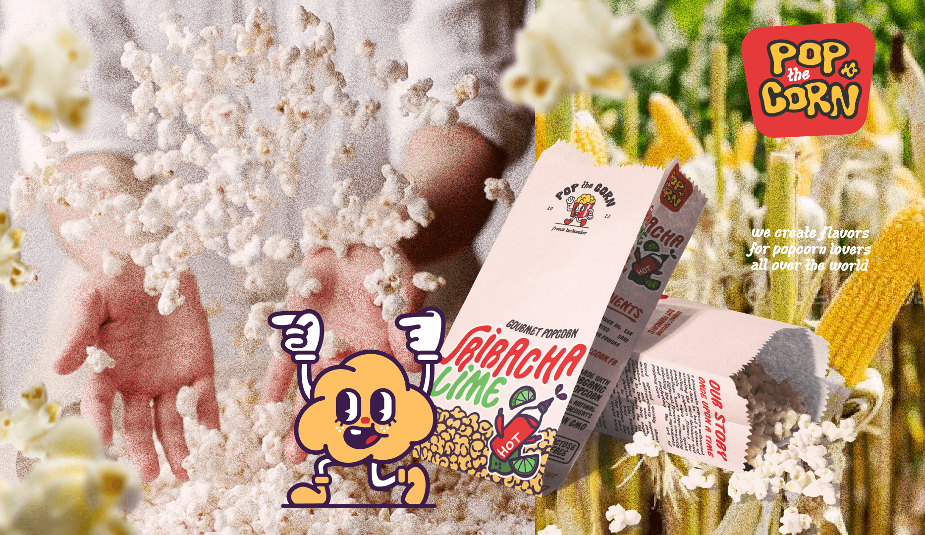
A playful popcorn identity bringing vintage cartoon charm to life through bold visuals and two lovable mascots.

/PROJECT/OVERVIEW
INTRODUCTION
A playful visual identity for Pop The Corn, a popcorn brand inspired by the expressive charm of 1930s cartoons and vintage animation.
GOALS
Build a bold and memorable identity that could bring the playful spirit of vintage cartoons into a distinctive popcorn brand.
CHALLENGE
The identity needed to feel nostalgic and playful without becoming dated, while giving the brand a strong personality.
/PROJECT/PROCESS
PROCESS_01
Research
Research focused on 1930s animation, vintage cartoon posters, hand-drawn lettering, expressive character design, and the graphic language of early animated films.
PROCESS_02
Strategy
The identity was built around character-driven storytelling, bold typography, and a playful visual language designed to make Pop The Corn instantly recognizable and full of personality.
PROCESS_03
Design decisions
Hand-drawn lettering, expressive characters, and vintage-inspired graphic elements were combined to recreate the energy of early cartoons. The two mascots became the visual anchors of the identity, bringing personality and storytelling to the brand.
/PROJECT/GALLERY


SERVICES
Brand Identity, Packaging, Illustration, Art Direction
DELIVERABLES
Illustration, logo variations, mockups, illustrated charas
TOOLS
Illustrator, Photoshop, Traditionnal Sketching
TIMELINE
3 days


